Creating a storefront for everyday shopping
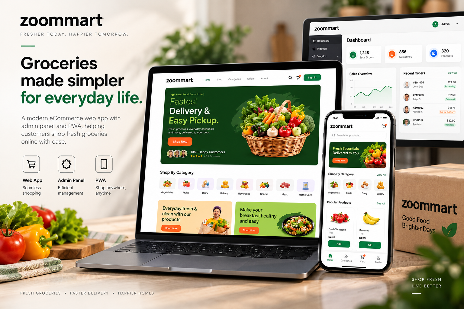
The customer experience was designed around speed and product discovery. Categories, featured products, offers and essential shopping actions are surfaced prominently so customers can move from opening Zoommart to finding what they need with minimal friction.
Building a responsive web application
Rather than limiting the experience to a traditional desktop storefront, the interface was designed to adapt naturally across screen sizes.
The same shopping experience remains accessible across desktop, tablet and mobile, allowing customers to shop using whichever device is most convenient.
Bringing an app experience to the web
Zoommart was developed as a Progressive Web App, giving customers an app-like experience without requiring a conventional app-store download.
This creates a practical bridge between the accessibility of a website and the convenience of a mobile shopping application.
Giving the business control with an admin panel
A dedicated administration system provides the operational side of the platform.
Products, categories and other essential storefront information can be managed centrally, creating a clearer workflow between what the business controls and what customers see.
Designing for future growth
The platform was structured as a digital commerce foundation rather than a one-off storefront. Its product, category and administrative architecture gives Zoommart room to expand its catalogue and shopping experience as the business grows.
 View Project